


 A teacher at Dawson College has spent some of his time in self-isolation at home developing a live, interactive data visualization of the COVID-19 pandemic, with a focus on Quebec that aims to show how social distancing and other interventions can slow down its spread. The graph shows how Quebec is doing compared to other regions.
"For a variety of reasons, the number of confirmed cases is increasing rapidly in Quebec," said Jonathon Sumner, a Physics teacher, "and we look uncomfortably similar to Italy three weeks ago."
Quebec acted early
"But, while the data for Quebec is worrisome, we can take some encouragement from the fact that Quebec acted early, closing schools almost immediately and businesses shortly thereafter. It has also started testing more aggressively. A straight-line on the plot means the number of confirmed cases is doubling at a constant rate. We will know our collective efforts are working when we start to see the curve flatten. This will indicate that the rate of doubling is starting to slow."
Jonathon started working on this project with the idea of showing the evolution of the pandemic in different parts of the world, while normalizing for population size, as well as showing the impact of interventions like physical distancing.
"A couple of days after we posted our data visualization online, the New York Times published their own version, which had the same intent," Jonathon said. "That made me us feel we were on to something. However, our graph aims to be most relevant to Quebec.
Showing impact of self-isolation
"What we really want to show is how each Quebecer's individual dedication to self-isolation contributes to flattening the curve every day. We hope that this work reminds everyone to not relent, and serves as positive feedback. We need to stick to the plan as laid out by Dr. Horacio Arruda: stay home, keep our distance, and wash our hands thoroughly!"
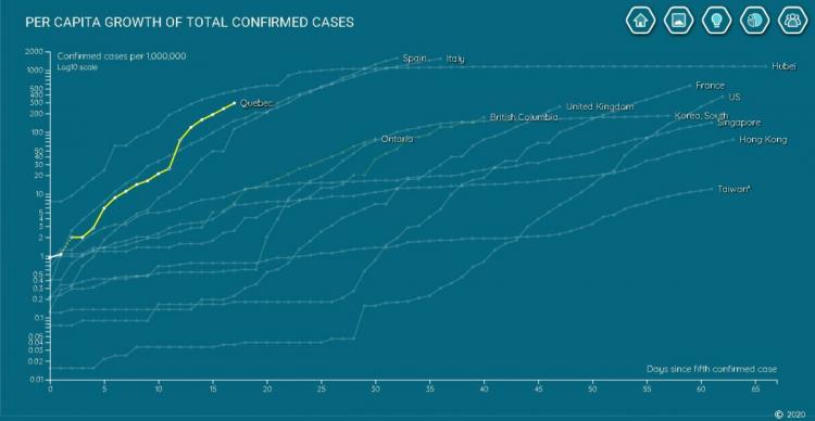
The graph is updated daily by pulling raw data automatically from the University of Toronto, Johns Hopkins University, and the New York Times.
In his spare time, Jonathon and his fellow Dawson College Physics teacher, Sameer Bhatnagar, run a data analytics and web development startup, named Scivero, which is focused mainly on educational data mining. "This is how we hang out (virtually) at the moment," Sameer said. "We do projects like this."
Three Dawson teachers involved
Sameer and another Dawson Physics teacher, Jean-François Brière, assisted Jonathon with the analysis.
The project is a work in progress. To view the live graph of COVID-19 and to read about the methodology, go to: https://scivero.com/visualizations/coronavirus
